With today’s interest rate environment, investors have been able to capitalize off high-yielding money market funds and/or savings accounts. We do not anticipate this kind of yield forever, since the Federal Reserve indicates plans to decrease interest rates gradually. Based on the Fed’s plan, investors should expect to earn a similar yield on their cash for at least the next couple of years. However, historical trends suggest that these decreases often turn out to be more dramatic than initially expected. Although we cannot predict the future, historical observation can help us best position your cash savings in anticipation of these interest rate changes.
The Fed’s Historical Pattern
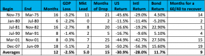
While the Fed often aims for gradual adjustments, historical precedents show that these cuts can be sharp and swift. This discrepancy often arises due to unforeseen economic challenges that require prompt action. For instance:
- Late 1990s: Rates peaked around 6-7% before a sharp drop during the early 2000s recession due to the “dot-com” bubble.
- 2008 Financial Crisis: Rates plummeted from over 5% to near zero in a matter of months as the Fed took drastic measures to stabilize the economy.
- COVID-19 Pandemic: The projected gradual rate cuts were replaced by swift actions to mitigate the sudden economic shutdown.

Preparing for Interest Rate Drops
To navigate the potential for both gradual and dramatic rate decreases, a strategic approach with your cash balance is necessary. Here’s how you can prepare:
- Establish your emergency fund: The first item we recommend when producing a financial plan is creating an emergency fund. As a general rule of thumb, we recommend holding 3 to 6 months of living expenses held in cash in a high yield savings account or a cash equivalent such as a money market fund. For our clients, we recommend Schwab’s Money Market Fund (SWVXX) parked in a brokerage account. This is currently earning 5.17% and the funds can be liquid in 3 days. Other options for high yield saving accounts include Betterment at 5.5%, Robinhood at 5%, and SoFi at 4.6%.
- Carve out cash for short-term goals: After establishing your emergency fund, evaluate your goals for the next few years. Whether it’s saving for a vacation, a home renovation, or a new car, having this money readily available will prevent you from needing to liquidate investments at an inopportune time. To keep your emergency fund separate from your short-term goal funds, we’d recommend utilizing a CD or Treasury with the maturity date aligned with when you’ll need the cash flow. For example, if you plan to fund your child’s wedding in 6 months, we recommend investing in a 6-month CD or Treasury security. 6-month treasuries are currently yielding 5.335%. 1-year treasuries are current yielding 5.147%.
- Invest in the market: Once your emergency fund and short-term savings are established, consider investing any additional cash into the market. With interest rates potentially dropping, the returns on money market funds and high-yield savings accounts may diminish. By investing in a diversified portfolio of stock and bonds, you can potentially achieve higher returns. Despite what rate you can get on your cash, it is always a good idea to invest your money in the market if it has a long-term focus.
Conclusion
By staying informed about the Fed’s actions and understanding their potential impact, you can make proactive decisions that enhance your financial security and growth. Securing liquidity for emergencies and short-term goals can help protect you from immediate financial risks. Simultaneously, investing the remaining cash allows you to grow your wealth, outpace inflation, and meet your long-term financial goals. If you have any questions or need tailored advice, don’t hesitate to reach out to a Rockbridge advisor.