Rockbridge
October 23, 2017
AllInvestingNews
Market commentary – October 2017
Stock Markets
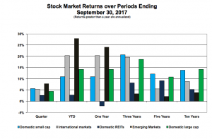
Equity market returns over several periods ending September 30, 2017 are shown on the graph to the right. Here are a few highlights:
- Stocks provided above-average returns over the past quarter – REITs lagged.
- Non-domestic markets led the way in recent periods; over longer periods it was domestic markets. While it would be nice to know which will do best in the future, no one does. We have to remain committed to all markets.
- Note how after falling short previously, emerging market stocks have snapped back in recent periods.
Bond Markets
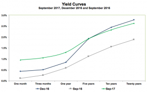
Yield Curves show the yield of U.S. Treasury securities over several maturities, from the short term (one month) to the long term (twenty years). How these curves have changed over the recent past is shown below.
- Since September 2016 yields have increased across all maturities, which is not surprising given the announced goals of Fed officials. Yields and bond prices are inversely related (when yields go up, prices come down and vice versa), which explains negative bond returns over the past year.
- Today’s Yield Curve is flatter than what we saw at the beginning of the year. The Fed can control only short-term rates; long-term yields generally reflect market results. A flat yield curve can indicate that the market doesn’t believe the Fed can increase rates down the road in a more difficult economic environment. Look how yields on longer-term securities have fallen slightly even though short-term yields increased.

