


Employment statistics are considered one of the best (if not the best) indicators of the health of our economy. Last Friday, August 2, the department of labor announced an unemployment rate of 3.7%, slightly higher than the 3.6% in April and May, but essentially the lowest it has been since a 3.5% reading in December of 1969. Most everyone agrees this is positive, though headline unemployment is only one statistic tracked by the department of labor, and probably isn’t the best statistic. In the rest of this piece, we’ll look at where our unemployment statistics come from, and what each of them means as it relates to the health of the economy.
About the Report
To measure unemployment, the government carries out the monthly Current Population Survey (CPS). Each month, the United States Census Bureau contacts approximately 60,000 households, each specifically selected as part of a representative sample of the population of the United States, to be interviewed for the survey. According to the Bureau of Labor Statistics (BLS), highly-trained Census employees “ask about the labor force activities or non-labor force status of the members of these households during the survey reference week.” Some households are contacted four months in a row while others are phased in and out of the survey for shorter periods. In this way, most of the sample is left the same from month to month, to strengthen the reliability of monthly changes in the collected data.
This survey is completely separate from the Establishment Survey which is released at the same time and tells us how many jobs were added each month. In the Establishment Survey, roughly 150,000 employers are contacted by the department of labor to get a sense of the total employment in the United States. The change each month becomes the jobs gained (or lost).
The Unemployment Rate
Over the last 71 years, the unemployment rate has averaged 5.7%, with a low of 2.5% in 1953 and a high of 10.8% in 1982. The current rate of 3.7% is very low by historical standards, with lower readings only observed in 6.7% of surveys. This number tells us what percent of the 60,000 households surveyed said they didn’t have a job and were looking for work. This is a great time to be looking for a job as prospects have improved from the 10.0% reading we saw 10 years ago in 2009.
Labor Force Participation
While this is positive, not all metrics are at 50-year lows. Another number often referenced is the labor force participation rate. A higher participation rate means a greater percentage of the population is looking for work. When this number ticks up, it’s generally viewed as a good thing even if it leads to a higher unemployment rate. Currently, our participation rate is 63.0%, meaning 63% of people age 16 and older are employed or looking for work. This is almost right on top of the average for the last 71 years (62.9%). We saw this number peak in 2000 at 67.3% and bottom in 1954 at 58.1%.
There are two factors that skew this number; the rise of participation by women in the labor force, and people living longer. Women steadily increased their participation from 1948 (32%) to 2000 (60.3%). Since then it has fallen slightly to 57.2%. If you account for this rise and only look at the last 30 years of U.S. Labor Participation you see a bleaker picture. The current 63.0% is near the bottom (62.4% in 2015) and below the 65.4% average of the last 30 years. However, we aren’t accounting for people living longer. Americans living later into their 80s and 90s is a good thing and no one expects them to work (unless they’re in politics).
Employment Ratio
Fortunately, the Bureau of Labor Statistics thought of this and consequently publishes a data set limited to ages 25-54, generally thought of as the prime working years for most Americans. The current rate of 79.5% is a little above normal. Over the last 30 years, we have realized an average of 78.7% with a minimum of 74.8% (2009 & 2010) and a maximum of 81.9% (2000). This better gauge of the current employment situation, the “Employment-Population Ratio: 25-54 Years” (https://data.bls.gov/timeseries/LNS12300060) tells us what percent of working age people are actually working. By not including seniors, it isn’t skewed by people living longer, it also gets around the question of whether workers are discouraged and not actively seeking jobs.
Median Weekly Earnings
Another gauge of the labor market is inflation adjusted weekly earnings. Though hourly wage data is more quoted, we prefer weekly earnings as it takes into account the amount of time worked. If median hourly wages are $100/hour but employers only allow 1 work hour each day, workers won’t have much income to live off. The Bureau of Labor Statistics began tracking weekly wages (for non-supervisory positions) in 1964, when they were $95.50/week. Most recently the number came in at $785.91/week, which seems like a big gain but isn’t because of inflation. If you set 1964 to $1.00/week, and adjust the numbers using the Consumer Price Index (CPI), current weekly earnings stand at $0.99, a bit above the $0.95 average from the past 55 years. The lowest real earnings came in 1996 at $0.84 and the highest was in 1973 at $1.13. Interestingly, earnings peaked right before the crash of 1973 (which saw the S&P 500 drop 48%) and they were the lowest in the lead up to the dot-com boom. Keep in mind, this is a median number that doesn’t include the highest paid members of the workforce. Another thing to note, wages have generally risen while the work week has generally shortened.
Total Wages Being Paid
Overall, the employment situation is very strong. Few people who want jobs aren’t working, and earnings are decent. Some will point to 2000 as a time when the job market was stronger, but on an inflation adjusted basis, earnings are currently 10% higher than they were 19 years ago. Others may point to 1973 as a time when workers were earning more but bear in mind labor was scarcer 46 years ago as less than 44% of women were actively seeking work, and the 25-54 employment ratio was only 71%. The following chart is a metric for total wages being paid as it multiplies the 25-54 employment ratio by an inflation adjusted weekly earnings index. This takes into account inflation and population growth.
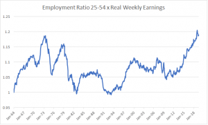
Setting the index to 1 in the first year of data, we get a current reading of 1.19, essentially the highest on record. This indicates the labor force is in good shape when accounting for number of people employed and wages being paid. This story shows itself in other data as well; currently there are 7.35 million job openings in America and only 6 million people looking for work. Hopefully the trend of the last decade continues and the American economy stays healthy.